The five vexillological* principles Mars mentions in his talk are as follows:
- Keep it Simple
- Use Meaningful Symbolism
- Use Two to Three Basic Colours
- No Lettering or Seals
- Be Distinctive or Be Related
Examples Mars uses of good municipal flags, distinctive yet simple, are Chicago and Amsterdam. These stand out as emblems of civic pride, such as the University of Chicago's admissions page having a section on the city's flag, and Amsterdam's appearing in embroidery. Not so good ones include San Francisco and Milwaukee. Searches for these flags lead to petitions for them to be changed, and when looking at them in light of the above five rules, it's easy to see why.
I won't go any more in-depth on these flags considering Mars spends 18 minutes doing just that in the first link above. Instead, I decided to look up the flags of the three Canadian cities where I've lived.
Toronto

Kitchener-Waterloo (no flag for Waterloo from what I can see)

Edmonton
Clearly, one of these flags conforms to the above principles, whereas two do not.
Toronto's flag:
- Keep it simple (and easily reproduced): Perhaps, in a jiffy, someone might make the T shape a little too straight. In the unlikely event Toronto were to find itself at war, I don't think people would mind the minor inaccuracy.
- Use meaningful symbolism: The T is made out of Toronto's City Hall towers. The maple leaf represents the Council Chamber, and is also present on Canada's flag. Bingo.
- Use two to three basic colours: This goes without saying.
- No lettering or seals: See #3.
- Be distinctive or be related: I've never seen a flag quite like it.
All told, this is a pretty solid flag.
Kitchener's flag:
- Keep it simple (and easily reproduced): Not really. I see an oddly-angled line, a beaver and some leaves.
- Use meaningful symbolism: The beaver is a very Canadian animal. What look like oak and maple leaves signifies the city's combined German and Canadian heritage. The diagonal line, and the strange colour of green rarely visible on any other flag... it's lost me.
- Use two to three basic colours: Almost. Make the beaver gold and it's good.
- No lettering or seals: This is where it falls apart. As Mars says in his TED talk, people should know a place's flag when they see it rather than having to read the flag to detect its origin. Even small, remote countries like Fiji see no point in adding text to their flags.
- Be distinctive or be related: The beaver also appears on the flag of Oregon, and in a more stylized fashion. Stylized is good. Kitchener's beaver should be more stylized, so it (a) looks more distinctive, and (b) is easier to reproduce (see #1).
.svg/2000px-Flag_of_Oregon_(reverse).svg.png)
I'm not sure what I'd do with this one. The green and gold on white look good. The rest could use an overhaul.
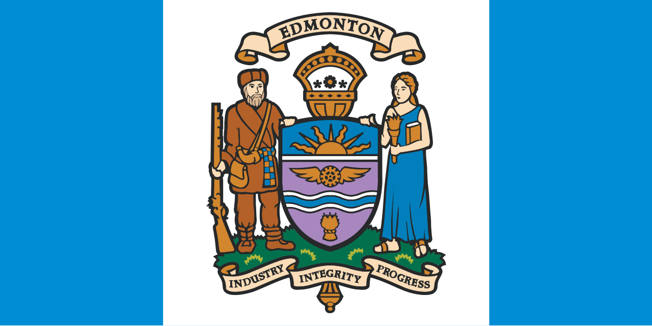
Edmonton's flag:
- Keep it simple (and easily reproduced): No. I can't even remember the motto written on the flag, and I saw it minutes ago. The picture would also be difficult to draw in a hurry.
- Use meaningful symbolism: The frontier exploration mentality, I get. The rest... is that a wheel with wings? A semi-stylized crown? When has anyone in Edmonton ever required a shield?! Also, seeing as Edmonton only has one river running through it, and is landlocked, I have no idea why two blue stripes are necessary.
- Use two to three basic colours: I count at least six, including lavender of all things.
- No lettering or seals: See #1.
- Be distinctive or be related: The shield and nature also appear in Alberta's flag. Is that related enough? I don't know.
Edmonton most likely needs a new flag. The situation isn't as dire as San Francisco or Milwaukee, but there's enough artistic talent in Edmonton to make it doable.
Unexpectedly, Sierra Leone's flag could provide a model. Edmonton's flag already uses green, white and blue. The green (agriculture and natural resources) speak to Edmonton quite well, considering the nearby prairies and first Albertan oil derrick. The white (unity and justice) are fitting in that Edmonton is the home of Alberta's legislature. The blue (water) is evident in the city's river valley. What this shows is that although the designs on Edmonton's flag are far too ornate, the flag contains some good colours.
This sort of back-of-the-napkin analysis could probably be done with any city's flag. It's probably the quickest way to think about civic duty I've ever encountered.
*Google Chrome considers this word a spelling mistake yet I spelled it correctly on the first try. Who's smart now, highly paid Google programmers?
No comments:
Post a Comment